Walk into a small bedroom painted the wrong color and you’ll feel it immediately: the walls seem to lean in, the ceiling sits lower than it should, and the whole room feels like it’s holding its breath. Walk into that same room painted the right color, and something quietly magical happens. The corners soften, daylight bounces a little further, and suddenly a space that barely fits a bed feels calm, generous, and inviting. Paint is the cheapest square-foot renovation you will ever do, and in a small bedroom — where every inch is felt — color choice matters more than anywhere else in the home.
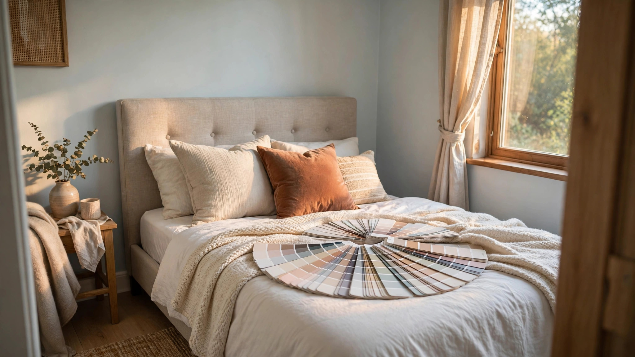
Small bedrooms aren’t a flaw to be apologized for. Across apartments, city homes, and even large houses, the coziest sleeping spaces are almost always the smallest ones. Humans sleep better in spaces that feel sheltering rather than cavernous. The trick is to choose colors that work with the room’s proportions instead of fighting them: colors that reflect light without glaring, create depth without weight, and establish a mood that makes you want to climb into bed. This guide walks through the best paint colors for small bedrooms — organized by strategy, not just by shade — plus the finishes, testing methods, and pro tricks that make color perform its best.
Before we look at specific colors, it helps to understand what paint actually does in a small room. A color’s lightness (how much light it reflects) and its temperature (warm versus cool) interact with your room’s natural light, its ceiling height, and even the direction your windows face. A soft blue that looks airy in a north-facing room can look cold in a windowless one; a creamy white that glows in afternoon sun can look dingy under warm bulbs. The colors below are the most reliable performers across conditions, but always test in your own light before committing — we’ll cover exactly how to do that later in this article.
The Light Reflective Value Secret Every Painter Knows
Professional painters think in a metric most homeowners never hear about: Light Reflective Value, or LRV. It runs on a 0–100 scale, where pure black is 0 and pure white is 100. LRV tells you what percentage of light a color bounces back into the room. For small bedrooms, the sweet spot is an LRV between about 55 and 85 — light enough to keep the room luminous, deep enough to avoid that sterile, hospital feel that ultra-white rooms can develop.
Most paint brands print the LRV on the back of the color chip or list it online. When you’re comparing two soft grays or two pale blues, the LRV often reveals which one will actually feel lighter on the wall — a difference your eye can’t reliably judge from a small swatch. Two colors that look nearly identical on a chip can be five or ten LRV points apart, and that gap is clearly visible across an entire wall.
One caveat: LRV describes the color under standardized light, not your room. A high-LRV color in a room with one small north-facing window won’t magically create sunshine; it will, however, squeeze the maximum out of the light that’s there. Pair your LRV knowledge with an honest assessment of your room’s orientation, which we’ll discuss next.
How Window Direction Changes Everything
North-facing rooms receive cool, bluish, indirect light all day. In them, warm colors (soft creams, warm grays, blush) compensate beautifully, while cool colors can look chilly unless you warm them up. South-facing rooms get abundant warm light, so cool colors (light blues, sage greens) stay crisp rather than icy, and warm colors can intensify — a soft beige might read more yellow than expected. East-facing rooms glow warm in the morning and cool off by afternoon; west-facing rooms are the opposite, getting punchy warm evening light.
For the small bedroom, the rule is simple: choose a color temperature that balances what the room gives you. Cool room, lean warm. Warm room, lean cool. Balanced light gives you free rein. When in doubt, the most forgiving choices are balanced neutrals — greige (gray + beige) and warm whites — that bend a little toward whatever light they receive rather than fighting it.
The Best White and Off-White Paints for Small Bedrooms
White remains the most popular small-room choice for good reason: nothing reflects light like it, nothing recedes as gracefully, and nothing pairs with everything else the way white does. But “white” is a universe, and the wrong white is one of the most common painting mistakes in small bedrooms. A stark, cool white in a dim room looks shadowy and gray in the corners; a yellowish white can look dated and heavy.
The best whites for small bedrooms have warm or neutral undertones that keep them luminous without turning cold. Think of them as softened light rather than painted-on brightness. They read as “glowing” in daylight and “warm” in the evening, which is exactly the arc a bedroom needs as it carries you from morning to night.
Warm Whites That Glow
Warm whites — with yellow, peach, or cream undertones — are the safest choice for north-facing or low-light bedrooms. They bounce warm light around the room and make shadowed corners feel intentional rather than dingy. In a small bedroom, a warm white on the walls paired with true white on the ceiling and trim creates subtle depth: the ceiling lifts, the trim frames, and the walls hold a soft glow. This three-tone trick (wall white slightly warmer than trim white) is one of the simplest ways professionals make small rooms feel finished.
Look for whites described as creamy, linen, or ivory rather than “bright” or “clean” — those marketing words usually signal cool undertones. And be wary of whites that look perfect on a tiny swatch: warm whites can shift noticeably as they cover a wall, so a larger test sample is essential.
True Whites and Soft Neutrals
If your room gets strong natural light, you have more freedom. A clean, neutral white will sparkle in a south-facing bedroom without looking cold, and it makes colorful bedding, art, and textiles pop. Soft neutral whites with barely-there gray or greige undertones are excellent all-rounders: they behave like white but with a whisper of depth that keeps them from feeling stark at night.
One technique worth trying in a small bedroom: paint the walls and ceiling the same white, with no cut line between them. Eliminating the visual boundary where wall meets ceiling dissolves the room’s edges, and the space feels larger because your eye can’t quite find where it stops. It reads as a design choice, not a shortcut, and it costs nothing extra.
Soft Blues and Greens: Color That Makes Rooms Breathe
If white feels too plain for your bedroom, soft blues and greens are the next best thing — and in many rooms, they’re better. Cool-leaning colors visually recede: they sit “behind” the eye the way distant hills do, which makes walls feel further away than they are. This receding effect is why designers reach for dusty blue and sage green in small rooms again and again.
The key is softness. You want colors that are muted and slightly grayed — “dusty,” “misty,” or “powder” versions rather than saturated ones. A muted blue reads as sky and water; a bright blue reads as swimming pool. In a small bedroom, muted wins every time.
Pale Blues for a Serene Retreat
Pale, powdery blues are the classic calming bedroom color, and the psychology backs it up: blue tones are consistently associated with lower heart rates and better sleep. In a small room, a soft blue with an LRV in the 60s or 70s keeps things luminous while adding the gentle color that makes a room feel designed rather than defaulted.
Consider carrying the blue up onto the ceiling — a pale sky tone overhead can make a low ceiling feel higher, especially in rooms with good natural light. And pair blue walls with warm wood tones and creamy textiles to keep the overall feeling cozy rather than clinical. Blue and warm wood is one of the most reliable pairings in interior design precisely because each balances the other’s temperature.
Sage Greens and Nature-Inspired Tones
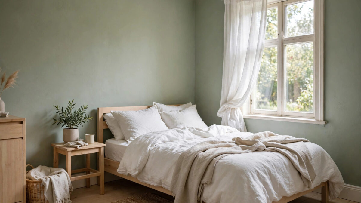
Sage green — that soft, grayish, botanical tone — has become the defining small-bedroom color of this decade, and it’s not hard to see why. It brings the calm of the outdoors inside, it recedes like blue but with a warmth blue sometimes lacks, and it works in nearly any light. Sage sits beautifully with linen, rattan, white, and wood, making it one of the easiest colors to decorate around.
Muted greens beyond sage deserve attention too: soft eucalyptus, pale olive, and gray-green tones all share sage’s small-room superpowers. They’re particularly flattering in bedrooms with wooden floors, since green and warm wood are natural companions. If you want a bedroom that feels like exhaling, start with green.
Warm Neutrals: Greige, Taupe, and Mushroom Tones
Not everyone wants a blue or green bedroom, and that’s where the modern warm neutrals shine. Greige — the famous gray-beige hybrid — became ubiquitous because it solves a real problem: it has gray’s sophistication without gray’s chill, and beige’s warmth without beige’s dated baggage. In a small bedroom, a light greige reads as warm, enveloping, and quietly elegant.
Taupe and mushroom tones push slightly further toward brown and purple-gray undertones, respectively. They add a layer of richness that lighter colors can’t quite reach, making them excellent choices if you want your bedroom to feel like a cocoon. The trick is to stay on the lighter side of the spectrum: once a warm neutral dips below an LRV of about 50, it starts to absorb more light than it gives, and the room contracts.
Warm neutrals are also the most forgiving colors for imperfect walls. In older homes with slightly uneven plaster, a light greige hides shadows and texture variations far better than a flat white, which shows every ripple. If your small bedroom has character (and walls to match), this is the category to shop.
Blush, Peach, and Warm Pastels
Blush pink has shed its nursery reputation and grown into one of the most sophisticated small-bedroom colors available. A muted, dusty blush — not bubblegum, not neon — casts a flattering warm glow that makes skin look healthy and lamplight look golden. It pairs beautifully with white, gray, charcoal, and natural wood, and it adds warmth without the heaviness of deeper colors.
Peach and apricot tones go one step warmer. They can be stunning in north-facing rooms, where their sunny undertones compensate for cool daylight. The rule with warm pastels is to keep them muted and slightly grayed; the gray keeps them grown-up, the warmth keeps them cozy. Test them at night under your bedroom lighting, though — warm pastels intensify under warm bulbs, and what looks delicate at noon can look peachy at 9 p.m.
The Dark and Moody Option: Can Small Bedrooms Go Dark?
Conventional wisdom says never paint a small room dark, and conventional wisdom is wrong. Dark colors — deep navy, charcoal, forest green, even near-black — don’t shrink a room; they blur its boundaries. In a small bedroom, dark walls can make corners disappear entirely, which paradoxically makes the room feel boundless, like a cocoon at night. Many designers’ most dramatic small-bedroom transformations use dark paint.
Dark paint succeeds in small bedrooms when you commit fully and light intentionally. Paint everything — walls, trim, even the ceiling — in the same deep tone for a seamless, enveloping effect. Then layer the lighting: bedside lamps, a soft overhead, maybe a picture light, so the room glows in pools rather than relying on bounced daylight. The result feels luxurious and intimate, like a boutique hotel room.
That said, dark is a commitment. It needs more coats, it shows touch-ups more, and it will absorb light — so it’s best in rooms with decent natural light or rooms you primarily use after dark. If you’re nervous, try a dark accent wall behind the bed first: it anchors the room’s focal point and gives you the drama with an easy exit if you change your mind.
How to Test Paint Colors the Right Way
The number-one cause of paint regret is testing badly. A two-inch chip viewed under store fluorescents tells you almost nothing about how a color will behave across 300 square feet of bedroom wall. Professionals test large, test in place, and test over time — and the process takes days, not minutes.
Start by narrowing to three or four contenders. Then buy sample pots and paint large swatches — at least two feet square — on poster board, not directly on the wall. (Poster board lets you move the color around the room and, crucially, removes it cleanly if you choose another shade.) Tape the boards up on the wall opposite the window, next to the window, and behind the bed, then live with them for at least two full days.
The 48-Hour Light Test
Check each sample at three times: morning light, midday, and evening under your actual bedroom lamps. Colors shift dramatically across these conditions. A gray that looks perfect at noon can turn lavender at dusk; a cream that’s lovely by day can glow yellow under warm bulbs. You’re not looking for a color that’s identical in every light — that doesn’t exist — you’re looking for one that looks good in all of them and that you never actively dislike.
Pay special attention to the sample on the wall opposite your window. That’s the wall you see when you wake up, and it’s the one that will define the room’s feeling most. If a color works there, it will work everywhere.
Test Next to Your Real Things
Hold the sample boards against your bedding, your curtains, your headboard, and your flooring. Colors don’t exist in isolation — your pale blue might clash with gray-blue sheets, or your warm white might fight with a cream carpet. The combination is the color; the chip is just a suggestion. Also consider your wood tones: orange-toned wood floors pair better with green and blue walls, while cooler gray floors pair better with warm neutrals.
Finishes and Sheens for Small Bedrooms
Color gets the glory, but finish quietly determines how it performs. In bedrooms, the standard professional recommendation is eggshell or satin on the walls: enough sheen to reflect a little light and wipe clean, but matte enough to hide wall imperfections and avoid glare. Flat or matte finishes hide flaws best and look the most sophisticated, but they show marks and can’t be scrubbed — fine for low-traffic bedrooms, risky if you have kids or pets.
For ceilings, always go flat — it hides the texture and never calls attention to itself. For trim, baseboards, and doors, semi-gloss or satin creates a subtle contrast with matte walls that reads as intentional and crisp. And here’s a small-room trick: a slightly higher sheen on the walls (satin instead of eggshell) bounces a touch more light around the room. The difference is subtle, but in a tiny bedroom, subtle differences compound.
The Ceiling, Trim, and the Fifth Wall
The ceiling is the most underused surface in small-bedroom painting. A bright white ceiling is the default, and it’s fine — but it’s not always optimal. Painting the ceiling the same color as the walls (in a flat finish) erases the visual seam and can make a low ceiling feel higher. Painting it a shade lighter than the walls creates a gentle lift. In a room with a very high ceiling, painting it a shade darker brings the height down to a cozier, more human scale.
Trim strategy matters too. In small rooms, painting trim the same color as the walls (in a higher sheen) creates a seamless, larger-feeling envelope — the eye travels uninterrupted. Contrasting white trim looks crisp and classic but visually chops the room into pieces, which can emphasize smallness. Neither is wrong; the seamless approach maximizes spaciousness, while the contrast approach maximizes architectural character. Choose based on which you value more.
Colors to Approach with Caution in Small Bedrooms
No color is truly forbidden, but some demand more skill to pull off. Highly saturated primary colors (fire-engine red, royal blue, sunflower yellow) advance visually — they come toward the eye — which makes walls feel closer and rooms smaller. If you love them, use them as accents: a headboard, artwork, or textiles, not four walls.
Cool grays are another category to handle carefully. The gray-everything trend of the 2010s produced countless bedrooms that looked sophisticated on a screen and chilly in person. If you love gray, choose one with warm undertones (greige) or pair a cool gray with warm lighting and warm textiles to compensate. And be cautious with very dark colors in windowless or nearly windowless bedrooms — without any daylight to play against, they can feel oppressive rather than cocooning.
Putting It All Together: Color Palettes That Work
If choosing still feels overwhelming, start from a proven palette rather than a single color. Here are four small-bedroom palettes that professionals return to constantly:
- Airy Scandinavian: warm white walls, white ceiling, pale oak floors, linen textiles in cream and soft gray, one black accent.
- Calm Botanical: sage green walls, warm white ceiling and trim, natural wood furniture, cream and terracotta textiles.
- Soft Coastal: pale blue walls, white ceiling, light wood or white furniture, navy and sand accents in bedding.
- Moody Cocoon: deep charcoal or navy on all walls and trim, flat ceiling one shade lighter, brass lighting, cream and camel textiles to lift it.
Each palette solves the small-room problem differently — through light, through nature, through coolness, or through deliberate darkness — but all of them share the essential qualities: enough lightness or enough commitment, balanced temperature, and colors that play well with real furniture and real light.
Frequently Asked Questions
What is the best paint color to make a small bedroom look bigger?
Q: What is the single best paint color to make a small bedroom look bigger?
A: There’s no single magic color, but light, cool-leaning colors with an LRV of 60–85 perform best: soft whites, pale blues, light sage greens, and light warm grays. Cool tones visually recede, and high light reflectance maximizes whatever daylight you have. That said, a well-executed dark color can make a small bedroom feel larger by blurring the room’s boundaries — spaciousness comes from strategy, not just lightness.
Should the ceiling be white or the same color as the walls?
Q: Should I paint the ceiling white or the same color as the walls in a small bedroom?
A: Both work. A white (or lighter) ceiling is the safe default and gives a gentle sense of lift. Painting the ceiling the exact same color as the walls — in a flat finish — erases the wall-ceiling boundary and can make a small or low-ceilinged room feel larger and more cohesive. For dark bedrooms, matching the ceiling to the walls creates the enveloping cocoon effect that makes dark paint work.
Does an accent wall make a small bedroom look smaller?
Q: Does an accent wall make a small bedroom look smaller?
A: Not necessarily. An accent wall behind the bed in a deeper tone of the same color family can add depth and a focal point without shrinking the room — darker colors recede. The problem comes when the accent color is much more saturated than the other walls or clashes with them, which breaks the room’s visual flow. Keep the accent in the same undertone family for best results.
What paint finish is best for bedroom walls?
Q: What paint finish or sheen is best for small bedroom walls?
A: Eggshell or satin for most bedrooms — they’re wipeable, reflect a bit of light, and hide minor imperfections. Flat or matte looks the most elegant and hides flaws best but marks easily. Use flat on ceilings, and semi-gloss or satin on trim and doors for a subtle, intentional contrast with the walls.
How do I choose between warm and cool colors?
Q: How do I know whether to choose a warm or cool paint color?
A: Look at your light. North-facing and low-light rooms benefit from warm colors that compensate for cool daylight; bright south- or west-facing rooms can handle cool colors without looking icy. Also consider your existing furnishings — warm wood floors and warm textiles pair naturally with cool walls, and vice versa. When in doubt, balanced neutrals like greige work in almost any condition.
Can I paint a small bedroom a dark color?
Q: Can I paint a small bedroom a dark color, or will it feel like a cave?
A: You can absolutely go dark — deep navy, charcoal, and forest green are stunning in small bedrooms. Dark colors blur the room’s corners and edges, which can make the space feel boundless rather than small. The keys are commitment (paint trim and ideally the ceiling too, for a seamless envelope) and layered lighting so the room glows in pools of lamplight. Avoid dark colors in nearly windowless rooms, where they can feel oppressive.
How many paint samples should I test?
Q: How many paint samples should I test before choosing?
A: Narrow to three or four finalists, then test each as a large swatch (at least 2×2 feet) on poster board, viewed over at least 48 hours in morning, midday, and evening light. More than four options creates decision paralysis; fewer than three means you haven’t explored enough. Always test against your actual bedding, flooring, and furniture.
Conclusion: Trust the Light, Then Trust Yourself
The best paint color for your small bedroom isn’t the one trending on social media or the one your favorite designer used in a mansion — it’s the one that works with your room’s specific light, flatters your furnishings, and makes you exhale when you walk in. Start with the physics: check the LRV, balance your color temperature against your window direction, and choose a strategy — luminous, receding, warm, or moody. Then test properly, live with your finalists for two days, and pick the one you never get tired of looking at.
Remember that paint is the most forgiving renovation in your home. A gallon or two, a weekend, and the willingness to test will transform a cramped-feeling bedroom into a space that feels intentional and calm. Small rooms reward decisiveness: pick a strategy, commit to it fully, and let the color do the quiet work of making the room feel exactly the size it should feel — yours.