There is a particular kind of bookshelf that stops you mid-scroll through a home tour: not the overstuffed shelves of a chaotic library, not the barren shelves styled by someone afraid of objects — but the shelf that looks collected over a lifetime, where every object seems to belong and the books look read rather than arranged. That effect is not accidental. It is the product of a few repeatable principles that anyone can learn, and this guide teaches them all.

Styling a bookshelf is really an exercise in visual editing. Most cluttered shelves are not suffering from too many things — they are suffering from too many things competing for attention at once, with no hierarchy, no breathing room, and no rhythm. The curated look comes from controlling those three elements deliberately. Whether your shelves hold two hundred novels or a mix of books, art, and objects, the method below will get you there.
Start by Emptying Everything
The single most transformative step is also the one people resist: take everything off the shelves. Every book, every object, every frame. Clean the shelves. Then sort what you removed into categories on the floor: books to keep, books to donate or relocate, decorative objects, frames and art, and the miscellaneous drift — candles, remotes, chargers, mail — that colonizes shelves over time. Be ruthless with the last category; a bookshelf is not a junk drawer with vertical storage.
Now edit the books themselves. A curated shelf does not require a small library — floor-to-ceiling books can look magnificent — but it does require intention. Remove the books you will never read again and do not love as objects; donate them. Group what remains loosely by size and, if you like, by subject or color family. You are not committing to rainbow order (more on that controversy below) — you are just getting oriented. Count your linear feet of books against your linear feet of shelf; the curated look typically uses books for 60 to 70 percent of shelf space, reserving the rest for objects and air.
The 70-20-10 Rule of Shelf Composition
A useful target for each shelf section: roughly 70 percent books, 20 percent decorative objects, 10 percent empty space. The empty space is not wasted — it is what makes the other 90 percent look deliberate. Shelves packed edge to edge read as storage; shelves with breathing room read as styled. If you have more books than this ratio allows, that is fine — dedicate some shelves to dense book storage (which looks great when uniform) and style the remaining shelves to the ratio.
Master the Building Blocks
Vertical and Horizontal Stacks
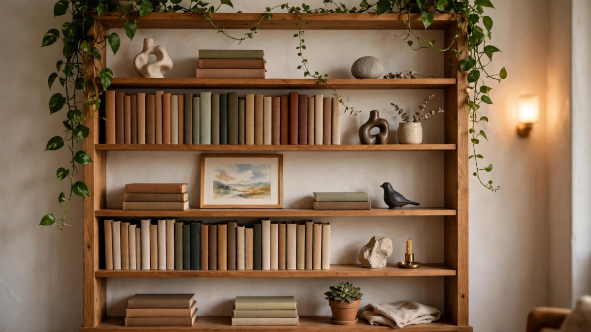
The foundation of shelf styling is alternating vertical rows of books with horizontal stacks. Vertical rows are the default — books standing upright, spines out. Horizontal stacks are two to six books piled flat, and they are the stylist’s secret weapon: they break the monotony of vertical rows, create platforms for small objects (a stack topped with a candle or a small sculpture reads instantly as styled), and fill short shelves elegantly. Alternate them down the shelf: a vertical run, a horizontal stack, a vertical run. The rhythm of tall-short-tall is what the eye reads as “designed.”
Leave some vertical rows slightly imperfect — a book leaning at an angle against a bookend, a small gap. Machine-perfect alignment reads as a store display; slight human irregularity reads as a home. But keep it slight: one leaning book is character, ten leaning books is a shelf that needs a bookend.
Bookends That Earn Their Place
Bookends are functional sculpture. A pair of heavy, beautiful bookends does triple duty: holds the rows, adds sculptural interest, and signals intention. Choose bookends with visual weight — stone, brass, wood — rather than flimsy decorative ones that slide under load. Alternatively, use a heavy object as a bookend: a large vase, a stack of art books laid horizontally at the row’s end, a potted plant in a weighty pot. The rule is that the bookend should look like it belongs in the composition, not like it was grabbed from another room.
Objects With Meaning
The objects on a curated shelf share one trait: they look chosen. A small sculpture from a trip, a beautiful bowl, a vintage camera, a piece of natural material like a geode or driftwood, a candle in a handsome vessel — each should be something you would display on its own merits. The fastest way to make shelves look cluttered is filling them with filler: generic small decorations bought in sets, which read as visual noise because they carry no personal weight and no scale confidence.
Scale matters enormously. Tiny objects scattered across deep shelves look lost; one substantial object per shelf section looks confident. As a rule, decorative objects should be at least a third the height of the shelf opening — smaller than that, group them in odd numbers (three small objects clustered read as one composition; one small object alone reads as forgotten). Vary the materials across the whole bookcase — wood, metal, ceramic, glass, textile, living green — so the eye travels through different textures rather than stalling on repetition.
Color, Rhythm, and the Rainbow Question
Color is where shelf styling succeeds or fails. The curated look almost always involves some color discipline — not necessarily monochrome, but controlled. Three approaches work reliably. The tonal approach groups books and objects in similar color families per shelf or per section (warm neutrals together, blues together), creating calm, sophisticated bands of color. The neutral-anchor approach keeps books as they are but ensures every shelf has neutral objects (white ceramic, natural wood, black metal) that visually rest the eye between colorful book spines. The full-embrace approach accepts the natural color chaos of a real book collection and balances it with generous empty space and minimal objects — the books are the color story, and everything else stays quiet.
The rainbow-bookshelf question deserves an honest answer. Organizing books strictly by spine color photographs beautifully and looks striking — for about a week. In practice, it makes finding books impossible, it forces awkward size mismatches (a tall red art book next to a tiny red paperback), and it prioritizes the shelf as a photo over the shelf as a library. If you love the look, try it on one small section as an accent rather than committing the whole bookcase. Most people who try full-rainbow revert within months; most who try tonal grouping keep it for years.
Creating Rhythm Across the Whole Bookcase
Step back and look at the bookcase as one composition, not shelf by shelf. The eye should move in a zigzag: a tall object on the upper left, a horizontal stack mid-right, a plant lower-left, a frame upper-right. Avoid stacking all the tall items on one side (the bookcase looks lopsided) or lining up identical compositions on every shelf (which reads as repetitive). Vary heights deliberately — tall, medium, low, medium, tall across a row of shelves creates a wave the eye enjoys following. Squint at the bookcase: you should see an interesting pattern of light and dark, tall and short, dense and airy. If one area goes muddy, that is where to edit.
The Details That Sell “Curated”
- Art on the shelf. Lean a small framed print or painting against the back of a shelf, in front of books. Layered art instantly elevates shelves from storage to styling — it is the single highest-impact trick in this guide.
- One living thing per bookcase. A trailing pothos, a small fern, a succulent — greenery adds life, color, and organic shape that no object can. Choose plants that tolerate the shelf’s light; trailing plants soften shelf edges beautifully.
- Vary book orientation within rows. Most spines out, but turn one or two books with pages facing out (in a neat stack) for textural contrast — the cream page-blocks break up spine-color noise elegantly.
- Hide the ugly necessities. Routers, chargers, and remotes live behind closed storage or in beautiful boxes, not on display shelves. Every visible cable subtracts from the curated effect.
- Light it. Small LED picture lights, puck lights, or strip lighting on shelves transforms the bookcase after dark and adds gallery-level polish for minimal cost. Warm white (2700–3000K) flatters books and wood.
- Style the top. The top of the bookcase is a shelf too — a large plant, a leaning piece of art, or a sculptural object up there finishes the composition. An empty dusty top undermines everything below it.
Maintaining the Look
A styled shelf decays without maintenance — books get shoved back randomly, objects accumulate, the mail migrates. The defense is a five-minute monthly reset: straighten rows, return drifted items to their homes, dust the shelves and objects (dust is the great enemy of the curated look — it dulls everything), and remove anything that arrived without an invitation. Seasonal re-edits, where you swap a few objects or rotate art, keep the shelves feeling alive rather than frozen.
Give the shelf a growth rule for books: when new books arrive, something leaves or gets relocated. Without a rule, the 70-20-10 ratio collapses within a year and you are back to storage. The rule does not have to be one-in-one-out — even “new books go to the dense storage shelves first” preserves the styled shelves’ composition.
Frequently Asked Questions
Should I organize books by color?
A: It photographs well but usually fails in practice — it makes books hard to find and forces awkward size mismatches. Tonal grouping (similar color families together per section) gives most of the visual calm with none of the dysfunction. Reserve strict rainbow order for a small accent section if you love the look.
How do I style shelves if I have too many books?
A: Dedicate some shelves to dense, uniform book storage — full shelves of books look intentional when they are consistently full — and style the remaining shelves to the 70-20-10 ratio. Alternatively, double-stack: a row of books behind a row of books on deep shelves, with the front row shorter. Never wedge books in wherever they fit; that is what creates the cluttered look.
What if my shelves are deep?
A: Deep shelves are an opportunity, not a problem. Layer: books at the back, a horizontal stack or object in front, or two rows of books with the front row shorter. Avoid pushing everything to the back wall — objects floating mid-shelf look lost. Use the depth for layering, which shallow shelves cannot do.
How many decorative objects are too many?
A: When you cannot name why each object is there, there are too many. Practically: one to three objects per shelf section, each with visual weight and personal meaning. If removing an object improves the shelf, it was clutter. Edit by subtraction — take three things off and live with it for a day before deciding.
Can I mix books with kids’ toys or office supplies?
A: Yes, with containment. Beautiful boxes, baskets, and bins on lower shelves hold toys and supplies invisibly while contributing texture to the composition. The rule is simple: functional storage is fine when it looks like storage designed for the shelf, not like clutter that landed there.
Do I need to buy matching book sets or decorative books?
A: No — and be cautious. Matching decorative book sets look staged rather than curated because they signal that appearance mattered more than content. A curated shelf is built from books you actually own and objects you actually chose. The only “bought for looks” items that work are neutral art and coffee-table books on subjects you genuinely enjoy.
How do I keep styled shelves dust-free?
A: Monthly dusting with a microfiber cloth or soft brush, working top to bottom. Fewer, larger objects dust faster than many small ones — another reason to favor substantial pieces. An air purifier in the room reduces dust accumulation noticeably. Accept that some dusting is the price of open shelving; closed cabinets are the alternative if you hate it.
Final Thoughts
The curated bookshelf is not about having beautiful things — it is about editing ordinary things beautifully. Empty the shelves, keep what matters, alternate vertical and horizontal, give objects breathing room, control the color, add one living thing and one piece of art, and light it warmly. That is the entire formula, and it works on a $50 thrift-store bookcase as well as it works on built-ins.
This weekend, pick one bookcase and empty it completely. By Sunday evening you will have the best-looking shelf in your home — and a repeatable method for every shelf after it. The books were always worth displaying. Now they will look like it.
Styling Small, Awkward, or Built-In Shelves
Not every bookcase is a grand freestanding unit. Small wall-mounted shelves, awkward narrow bookcases, and built-ins around fireplaces each need adapted tactics. On small floating shelves, less is more: one horizontal stack with an object on top, or three to five vertical books with a single sculptural piece. Resist filling small shelves edge to edge — negative space is what makes them look designed rather than cramped.
Narrow bookcases (under a foot wide) suit single-column compositions: alternate a short vertical run, a horizontal stack, a tall object, down the column. The constraint becomes the style — narrow shelves styled consistently look intentional and graphic. For built-ins flanking a fireplace or TV, treat the pair as one composition mirrored loosely: similar visual weight on both sides, but not identical styling, which looks stiff. Keep the shelves near the TV simpler and darker-toned so they do not compete with the screen; let the farther shelves carry the brighter objects and art.
Awkwardly tall shelves — openings of eighteen inches or more — defeat standard styling because books look lost. Solve with stacking: two horizontal stacks, one atop the other, or a tall object (a large vase, a sculptural piece) anchoring the space with books beside it. Alternatively, add a shelf: a simple extra board at mid-height, cut to fit, instantly converts one awkward opening into two usable ones. It is the cheapest structural improvement in shelf styling.
When the Books Themselves Are the Problem
Sometimes the collection fights the aesthetic: mismatched heights, garish mass-market spines, or simply too many. Tactics that help without purging beloved books: face the worst offenders’ pages outward in neat stacks (cream page-blocks are uniformly attractive), group the loudest spines together on one lower shelf where they read as a single bold band rather than scattered noise, or use book covers — simple kraft or linen slipcovers on the most visually chaotic titles create calm uniformity while keeping the books. None of these require getting rid of a single book you love; they are camouflage, not censorship.
Finally, photograph your finished shelves. A photo reveals composition flaws your eyes miss in person — the lopsided section, the object that disappears against the background, the shelf that went too dense. Adjust from the photo, not from memory. Stylists work this way on every shoot, and your bookcase deserves the same professional eye. One photo, a few tweaks, and the shelf goes from good to genuinely curated.