Here’s a confession: my first apartment looked like a furniture store exploded. I owned nice things — a decent sofa, a rug I genuinely liked, art I was proud of — and somehow the room looked worse than the empty version. Everything was the right size for some room, just not mine. Nothing talked to anything else. It took me years to learn that good rooms aren’t about taste. They’re about rules — and the good news is, the rules are learnable.
These are the ten rules I wish someone had handed me on day one. They’re not about a style. They work whether you love mid-century minimalism or maximalist grandma-core. Break them later, once you know why they exist. But learn them first.
1. Measure the Room Before You Fall in Love With Anything
This is rule number one because breaking it is the most expensive mistake in decorating. Measure the room — length, width, ceiling height, window placements, door swings — and write it down somewhere you’ll actually keep, like a note on your phone. Then measure the furniture you’re considering.
Here’s the guideline designers actually use: leave 30 to 36 inches of walking space around major furniture pieces. A coffee table should sit 14 to 18 inches from the sofa — close enough to set down a drink without standing up. A dining table needs 36 inches of clearance on the sides where people pull out chairs, 24 if it’s against a wall and rarely used.
My exploding-apartment sofa was 96 inches long in a room that was 11 feet wide. It fit — technically. But it ate the walking path, so everyone sidled around it like it was a piece of airport security equipment. Tape the footprint of any big purchase on your floor with painter’s tape before you buy. It looks silly. It has saved me from three bad purchases, including a sectional that would have blocked a closet door.
2. Every Room Needs a Focal Point (Pick It on Purpose)
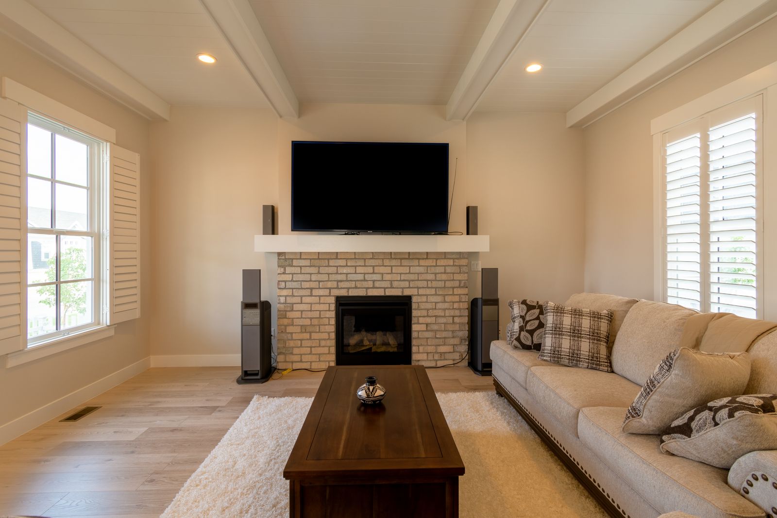
Walk into any room that feels “designed” and your eye lands somewhere specific — the fireplace, a big window, a bold piece of art, the bed. That’s the focal point, and every room needs exactly one. Rooms without one feel restless. Rooms with three feel chaotic.
Here’s the part beginners miss: if your room doesn’t have a natural focal point (no fireplace, no great view), you have to create one. Hang your biggest piece of art over the sofa. Make the bed the star with good bedding and a headboard. Paint one wall a deeper color. The focal point is where you spend your best stuff — the statement light, the nicest textile, the art you love most.
Then arrange everything else to support it. Sofas and chairs angle toward the focal point, not toward the walls. Rugs anchor under it. This one decision — “the fireplace is the star, everything faces the fireplace” — instantly organizes a room that felt random. When a room feels off and you can’t say why, nine times out of ten the furniture is ignoring the focal point.
3. The 60-30-10 Color Rule (Your Training Wheels)
Sixty percent dominant color, thirty percent secondary, ten percent accent. It’s the simplest color formula in design, and it exists because most beginners do one of two things: paint everything beige and buy beige furniture (a beige cave), or buy twelve colorful things they love individually that fight each other in the same room (a circus).
The 60 is your walls and big furniture — the background. The 30 is curtains, bedding, a rug, an accent chair — the supporting cast. The 10 is pillows, art, a throw, a lamp — the jewelry. When a room feels “too much,” it’s almost always the 10 that grew to 40. When it feels flat, the 10 is missing.
You don’t have to follow this forever. Plenty of beautiful rooms are 80-20 or wild with pattern. But until you can look at a room and feel the balance, 60-30-10 keeps you safe. Pick your 10% accent first if you’re stuck — it’s the fun part, and everything else gets chosen to support it.
4. Hang Curtains High and Wide (The Cheapest Upgrade There Is)
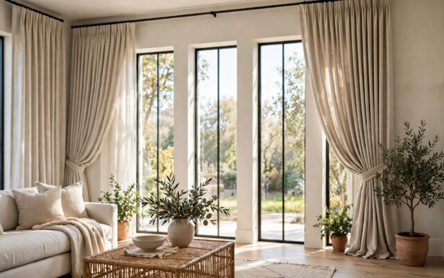
If I could force one change on every beginner’s home, it would be this. Curtains hung right below the ceiling and extended 6 to 12 inches past the window frame on each side. Not at the top of the window. Not just covering the glass. High and wide.
Why it works: it makes the window look bigger, the ceiling look taller, and the whole room look more expensive. Curtains that barely cover the window chop the wall into pieces and make everything feel cramped. It’s the difference between a room that looks finished and one that looks like a rental someone gave up on.
The practical details: curtain panels should just kiss the floor or puddle very slightly — never hover two inches above it (that’s the “high-water pants” of decorating). Buy them long; you can hem cheap panels for less than the cost of buying the right length. And get them wide enough to actually close if you want privacy — a good rule is panels totaling 1.5 to 2 times the window width for a full look.
5. Lighting Comes in Layers, Not One Sad Ceiling Light
The single overhead light — especially a bare bulb or a dated flush mount — is responsible for more ugly rooms than any furniture choice. Overhead light alone casts harsh shadows downward, makes everyone look tired, and flattens the room. Designers think in three layers, and you should too.
Ambient is the general light — the ceiling fixture, recessed lights. Task is light for doing things — a reading lamp by the chair, under-cabinet lights in the kitchen, a desk lamp. Accent is the fun stuff — a picture light over art, a small lamp on a shelf, candles. A room needs at least two of the three to feel alive; three is the goal.
The fastest fix in any room: add a floor lamp and a table lamp, both with warm bulbs (2700K — check the box, it matters more than the brand), and put them on different sides of the room. Suddenly there’s depth. Corners glow instead of disappearing. And here’s the trick that costs nothing: turn off the overhead light in the evening. Lamps-only lighting after dark makes almost any room feel intentional and calm. I do this every night and it never stops working.
6. Rugs: Go Bigger Than You Think (Then Go Bigger Again)
The number one rug mistake is buying too small. A tiny rug floating in the middle of a room, with all the furniture legs off it, makes the room look smaller and the rug look like a postage stamp. Designers have a simple rule: in a living room, at least the front legs of every major piece of furniture should sit on the rug. In a dining room, the rug should extend 24 inches past the table on all sides so chairs stay on it when pulled out. In a bedroom, it should extend 18 to 24 inches past the sides of the bed.
What this means in practice: most living rooms need an 8×10, not a 5×7. Most bedrooms need a 9×12 or at least an 8×10 under a king. Yes, bigger rugs cost more. But a too-small rug is wasted money — it does nothing for the room. I’d rather have a big, inexpensive flatweave than a small, expensive Persian-style rug. Size does more work than quality here.
One more rug truth: if you’re layering (a flat jute with a smaller patterned rug on top — very trendy, very forgiving), the bottom layer does the sizing job and the top layer does the personality job. It’s the easiest way to use a rug you love that’s technically too small.
7. Odd Numbers and the Rule of Three
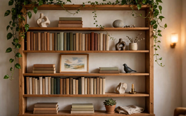
Here’s a weird little rule that genuinely works: objects look better in odd-numbered groups. Three candlesticks beat two. Five books stacked beat four. Nobody fully knows why — something about how our eyes move across groupings — but stylists use it constantly, and once you see it you can’t unsee it.
The practical version is the rule of three for surfaces. When you’re styling a coffee table, a shelf, or a console, think in three elements: something tall (a vase, a candlestick), something medium (a stack of books, a small plant), something low or textural (a bowl, a tray). Vary the heights, vary the materials — glass, wood, something living — and leave some empty space. A styled surface that’s 60% full looks curated. One that’s 100% full looks like a gift shop.
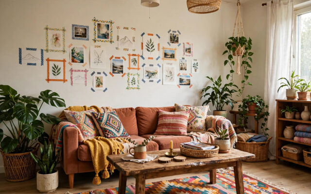
This rule also rescues gallery walls. Three frames in a row, or an arrangement built around one big piece with smaller ones orbiting it, reads as intentional. Nine same-size frames in a perfect grid also works — that’s symmetry doing the job instead. What doesn’t work is two lonely frames floating on a big wall, or seven random frames with no relationship to each other. Commit to odd groupings or strict symmetry. The mushy middle is where walls go to look accidental.
8. Mix Textures, Not Just Colors
Beginners obsess over color matching and ignore texture entirely. But texture is half of what makes a room feel rich. A beige room with linen, wool, wood, leather, and a nubby rug feels warm and layered. A beige room with all smooth polyester and flat paint feels like a waiting room. Same colors, completely different feeling.
The fix is simple: in every room, include at least one rough texture (jute, raw wood, stone), one soft texture (velvet, wool throw, linen), and one smooth or shiny thing (glass, metal, lacquer). You don’t need to think about it harder than that. A wood coffee table, a linen sofa, a wool rug, a brass lamp, a glass vase — that’s a complete texture story, and it took zero design training.
Texture is also the secret weapon of neutral rooms. If you love whites and beiges but your room feels flat, don’t add color — add texture. A chunky knit throw on a linen sofa does more for a neutral room than a colorful pillow that fights the palette. This is how those calm, expensive-looking minimalist rooms actually work: they’re not empty, they’re textural.
9. Negative Space Is a Design Choice, Not Emptiness
The urge to fill every wall, every corner, every surface is the beginner’s curse. I know because I had it. Every blank spot felt like a problem to solve, so I solved them all — and the result was a room where your eyes had nowhere to rest.
Here’s the reframe: empty space is what makes the full spaces look good. A gallery wall needs a plain wall next to it. A styled shelf needs an empty shelf. A bold chair needs breathing room around it. Designers call it negative space, and it’s doing real work — it gives the eye a place to land, which makes everything else look more deliberate.
Practical test: stand in your doorway and look at the room. If your eye bounces around without settling, you probably need to remove something, not add something. Try taking one item off every surface and living with it for three days. Almost everyone who tries this keeps it that way. The room doesn’t feel emptier. It feels calmer, and the things that remain suddenly look better — like they were chosen, not accumulated.
10. Live in It Before You “Finish” It
This is the rule that saves the most money. Don’t try to finish a room in a weekend. Move in the big pieces, live with them for a month, and pay attention to how you actually use the space. Where do you naturally drop your keys? Which chair do you actually sit in? Where does the light fall at 5pm?
Every room I’ve rushed looked good in photos and annoyed me daily. The reading chair I placed for symmetry that nobody sat in because it faced away from the conversation. The beautiful rug under the dining table that I hated cleaning. The art I hung at “gallery height” in a hallway where everyone looks at it from three feet away. Living in the room first would have told me all of this for free.
So buy the sofa, the bed, the table — the bones. Then wait. The right lamp, the right art, the right small pieces reveal themselves once you know the room’s habits. A room decorated slowly, in response to real life, always looks better than one decorated in a single shopping spree. It has the one thing money can’t buy quickly: evidence that someone actually lives there.
The 10-Minute Room Audit (Do This Tonight)
Reading rules is easy. Seeing your own room clearly is hard, because you stop noticing it. Here’s a ten-minute exercise that applies everything above. Grab your phone.
First, photograph the room from the doorway — the view you and every guest actually get. Now look at the photo, not the room. Photos flatten everything and show you what visitors see: the too-small rug, the curtains hung at window height, the lonely frame on the big wall. Circle the three things that bother you most in the photo. That’s your priority list, and it’s more honest than any amount of staring.
Second, sit in every seat for thirty seconds. Is there a light you can reach? A surface for a drink? A view of something worth looking at, or are you staring at a blank wall? Rooms fail the sit test constantly — beautiful chairs placed where nobody wants to sit. Move one chair tonight to face the conversation or the window and see how it feels tomorrow.
Third, do the evening light check. After dark, turn off the overheads and turn on every lamp. Walk the room. Dark corners mean you need another lamp or a brighter bulb. Harsh pools of light mean a shade problem. This single check tells you more about your lighting than any article can.
Write down the three fixes, in order of cheapest first. Curtains, lamp placement, and rug position are almost always on the list — and they’re all free or close to it. Do those this weekend. The rest can wait until you’ve lived with the improvement for a month. That’s rule ten doing its job.
Where to Start This Weekend
If all ten rules feel like a lot, here’s the order I’d do them in. First, fix your curtains — high, wide, touching the floor. It’s a two-hour job that transforms a room. Second, add lamp lighting and kill the overheads at night. Third, check your rug size and pull the furniture legs onto it.
Those three changes cost less than a new sofa and do more than one. Then live with it. Measure before the next purchase. Pick your focal point. Add texture before color. Leave some space empty on purpose.
Good rooms aren’t born from good taste. They’re built from good decisions, one at a time, in the right order. You already have everything you need except the order — and now you have that too.