There’s a fine line between a room that looks collected and layered, and one that looks like a fabric store exploded in it. Mixing patterns — florals with stripes, geometrics with organic prints, checks with ikat — is one of the fastest ways to give a room personality and depth. It’s also one of the easiest ways to create visual chaos if you do it without a plan.
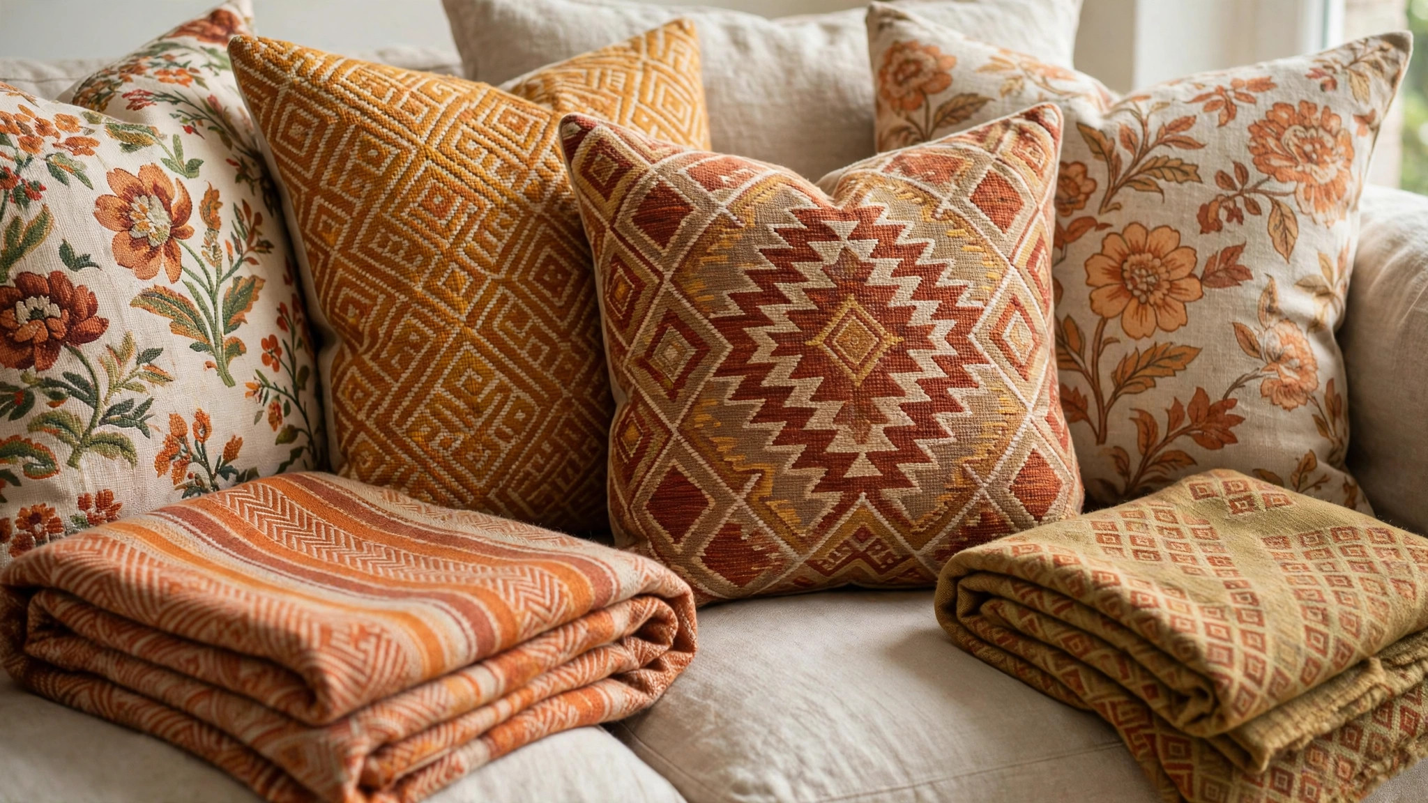
The good news is that pattern mixing isn’t some mysterious designer instinct you’re either born with or not. It’s a skill built on a handful of repeatable principles: controlling the color palette, varying the scale of your patterns, balancing pattern types, and knowing when a solid surface needs to step in and give the eye a rest. Once you understand the framework, you can break it with confidence instead of by accident.
This guide walks through the practical rules designers actually use — the 60-30-10 distribution, scale contrast, the color-thread trick, and how to layer texture alongside pattern — plus room-by-room applications and the most common mistakes that make pattern mixing go wrong. No talent required, just a system.
Why Pattern Mixing Works (When It Works)
Pattern does something solid color can’t: it creates movement, rhythm, and visual interest. A room of all solids can feel flat, even if the colors are beautiful. Patterns add a layer of complexity that makes a space feel finished and intentional — they suggest a home that evolved over time rather than being ordered from a catalog in one afternoon.
The reason pattern mixing fails is almost never “too many patterns” in some absolute sense. It’s the absence of a unifying logic. When every pattern in a room shares a color story and the scales are deliberately varied, the eye reads the combination as harmonious. When patterns fight — competing for attention at the same scale, in clashing color families, with nothing solid to anchor them — the result is visual noise. The principles below are all about creating that unifying logic.
Rule 1: Anchor Everything to One Color Palette
This is the single most important rule. Choose a palette of three to five colors for the room — say, navy, warm white, camel, and a touch of rust — and make sure every pattern you introduce contains at least two of those colors, with one shared color appearing in nearly all of them. That shared color is the thread that ties disparate patterns together.
The palette should include lights, darks, and at least one mid-tone so patterns have contrast against each other. A common beginner mistake is choosing patterns that are all the same value — five medium-toned prints in different colors will blur together into mud. Mix a bold dark pattern with a light airy one and a mid-tone bridge, and each gets room to breathe.
Neutrals count as colors here. Cream, charcoal, natural linen, and warm gray are workhorses in pattern mixing because they appear in so many prints. If you’re nervous, build your scheme around two neutrals plus one or two accent colors, and let the patterns carry the accents.
Rule 2: Vary the Scale — Big, Medium, Small
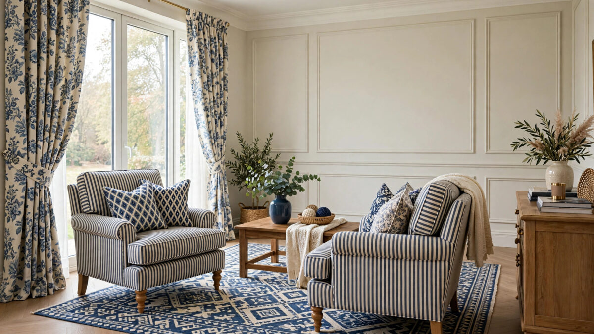
Professional designers almost always mix patterns at three different scales: one large-scale pattern, one medium, and one small. A large-scale floral or oversized geometric on curtains or a rug, a medium-scale stripe or check on upholstery, and a small-scale dot, mini-floral, or tight geometric on throw pillows. The scale contrast is what keeps patterns from competing.
The classic failure mode is two medium-scale patterns side by side — say, a medium floral sofa next to medium striped chairs. At the same scale, the eye can’t establish hierarchy, and the two prints appear to vibrate against each other. Change one to a large scale or a small scale and the tension disappears.
A useful test: photograph the room (or the fabric swatches together) and squint at it. If the patterns merge into distinct layers — background, middle ground, detail — the scales are working. If everything buzzes at the same frequency, adjust.
Rule 3: Mix Pattern Families, Not Just Patterns
Patterns fall into loose families: geometrics (stripes, checks, chevrons, fretwork), organics (florals, botanicals, animal prints), classics (damask, toile, paisley), and ethnics/texturals (ikat, kilim, mudcloth, block prints). The most interesting rooms combine across families rather than stacking three florals.
Some pairings are nearly foolproof. Stripes go with almost everything — they’re the neutral of the pattern world, adding structure without competing. A stripe plus a floral plus a small geometric is the classic designer trio. Animal print (leopard, zebra) functions as a neutral in small doses. Ikat and kilim bring energy and pair beautifully with calmer stripes or solids.
Within a family, vary the mood: pair a formal damask with a casual ticking stripe rather than two formal prints. Contrast in formality keeps the room from feeling like a showroom.
Rule 4: Follow the 60-30-10 Distribution
Think of pattern the way you’d think of color: roughly 60% of the room should be solid or near-solid (walls, large upholstery, flooring), 30% carries your main pattern (curtains, rug, or a statement chair), and 10% is the accent pattern (throw pillows, a lampshade, art). This ratio guarantees the eye always has calm surfaces to rest on.
Beginners often invert this — patterned sofa, patterned rug, patterned curtains — and wonder why the room feels frantic. Solids are not the absence of design; they’re the frame that lets patterns shine. A bold patterned rug looks twice as striking on a neutral floor with a solid sofa than it does fighting a patterned sofa.
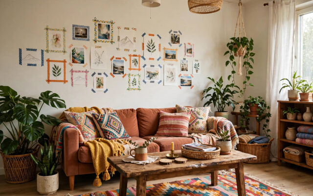
If you love maximalism and want more pattern, keep the 60-30-10 logic but make the “solids” heavily textured instead — a nubby linen sofa, a jute rug, plaster walls. Texture reads as calm to the eye while still adding richness.
Rule 5: Use Solids and Texture as Bridges
Between any two patterns that feel like they’re arguing, insert a solid. A solid lumbar pillow between two patterned throw pillows, a solid throw blanket draped over a patterned chair, a plain linen shade on a patterned lamp base — these buffers are the punctuation marks of pattern mixing.
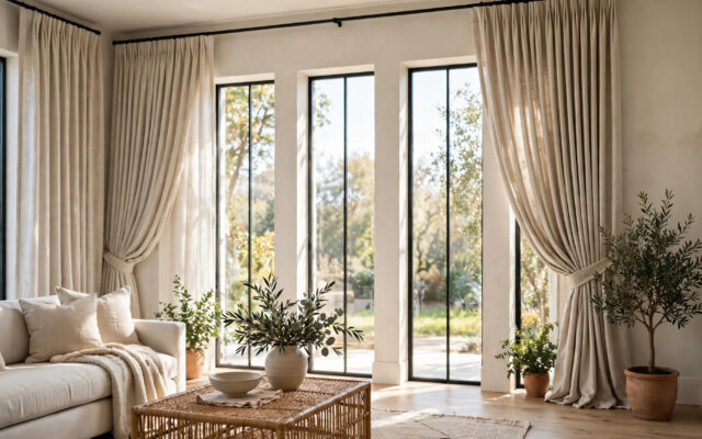
Texture deserves equal billing with pattern. Velvet, linen, wool, rattan, leather, and boucle add tactile variety that the eye reads as interest without adding visual busyness. A room with three patterns and four textures feels layered and calm; a room with six patterns and no texture feels chaotic. When in doubt, add texture before adding another pattern.
Putting It Together: The Living Room
Let’s build a concrete example. Start with solid warm-white walls and a natural-fiber rug (your 60%). Add curtains in a large-scale botanical print in navy, green, and cream (your 30% — the hero pattern). Choose a sofa in solid camel linen and two armchairs in a medium navy-and-cream stripe. Now the 10%: throw pillows in a small rust geometric, a cream lumbar in nubby texture, and one pillow that repeats the curtain botanical at a smaller scale to echo the hero.
Check the rules: every pattern contains navy or cream (shared thread) ✓; scales go large (curtains), medium (chairs), small (pillows) ✓; families mix organic (botanical), geometric (stripe, small print) ✓; solids dominate ✓. This room will read as cohesive and collected.
The Pillow Formula
Throw pillows are the lowest-commitment place to practice. A reliable formula for a sofa: two larger pillows in your medium pattern, two smaller in your small pattern, and one lumbar in a solid texture. Odd numbers and varied sizes look more natural than matched sets. And remember — pillow covers are cheap to swap, so this is where you can experiment boldly.
Putting It Together: The Bedroom
Bedrooms want calmer pattern mixing since the goal is rest. Keep the palette tighter — three colors maximum — and let one pattern lead. Example: white bedding with a subtle tone-on-tone texture as the base, a duvet in a medium-scale soft floral or block print, shams in a small coordinating geometric, and a solid throw at the foot. Curtains in a quiet stripe that shares the palette complete the scheme.
In bedrooms, pattern scale can skew smaller overall — large bold prints on every surface can feel energizing rather than restful. Reserve the biggest pattern moment for one element (the rug or the curtains) and keep the bed itself in the small-to-medium range.
Common Mistakes That Make Pattern Mixing Fail
- Same scale everywhere. Two medium prints side by side is the number-one cause of pattern clashes. Vary large, medium, and small deliberately.
- No shared color. Patterns with zero colors in common look random no matter how pretty each is individually. Find the thread.
- All pattern, no solid. Without solid surfaces for the eye to rest, even well-chosen patterns overwhelm. Respect the 60% calm.
- Matching instead of coordinating. Buying the exact same floral in curtains, pillows, and upholstery looks dated and flat. Coordinate — don’t match.
- Ignoring undertones. A cool gray stripe and a warm beige floral will fight even if both are “neutral.” Keep undertones consistent.
- Forgetting the rug. The rug is usually the largest pattern in the room. Choose it first, then pull your palette and secondary patterns from it — not the other way around.
- Too many “hero” patterns. A room needs one star. If the curtains, rug, and sofa are all shouting, nobody gets heard. Demote two of them.
Advanced Moves: Going Bolder With Confidence
Once the basics feel natural, try these. Pattern drenching — using one pattern on walls, curtains, and upholstery in varying scales — works when the palette is extremely disciplined (often tone-on-tone). Clashing on purpose works when you commit fully: two bold patterns in complementary colors, balanced by generous solids elsewhere, reads as confident rather than accidental. Mixing eras — a vintage floral with a modern geometric — adds the collected-over-time quality that makes rooms feel personal.
The through-line in every advanced move is intentionality. Bold mixing fails when it looks like an accident and succeeds when it looks like a decision. The rules above are what make it look like a decision.
Starter Projects: Practice in Low-Stakes Places
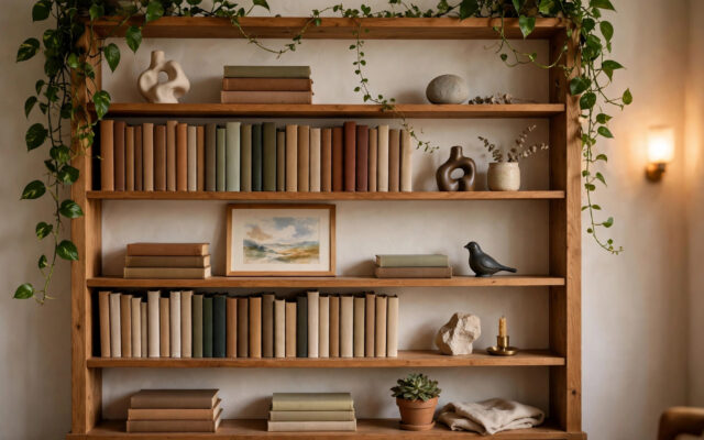
If a whole living room feels like too much commitment, start where mistakes are cheap and contained. The powder room or hallway is ideal: a bold wallpaper in a tiny space is a classic designer move because the small square footage keeps costs low while delivering maximum personality. A bookshelf styled with patterned bookends, boxes, and art lets you practice the scale rules in miniature. Bedside tables — a patterned lamp base, a small geometric tray, a textured shade — are another contained canvas.
The dining room is a great intermediate step: pattern on chair seats or a table runner, a bold rug under the table, curtains that share the palette. Because dining rooms are used intermittently, you can go slightly bolder than in rooms you inhabit all day. Each small project builds your confidence for the bigger rooms — and your eye genuinely improves with practice. After three or four of these, the living room won’t feel intimidating at all.
Working With Existing Pieces You Can’t Change
Most of us aren’t starting from empty rooms. The rental carpet, the inherited sofa, the tile you didn’t choose — these are constraints, not dealbreakers. The method: identify the “given” colors and undertones in your fixed elements first, then build your palette around them. A beige rental carpet with warm undertones means your palette should lean warm; fighting it with cool grays will always look off.
For a large fixed pattern you dislike (dated tile, a busy carpet), the strategy is quiet everything around it: keep surrounding patterns minimal and let solids dominate, so the offending element becomes background rather than a combatant. Conversely, a fixed element you love — a vintage rug, original tile — becomes the palette source: pull two or three colors from it and let them govern every new pattern you add. Constraints actually make pattern mixing easier, because they narrow your choices.
Frequently Asked Questions
How many patterns are too many in one room?
There’s no magic number, but three to five distinct patterns is the sweet spot for most rooms, supported by plenty of solids and texture. Beyond five, you need an exceptionally disciplined palette to keep things coherent. Beginners should start with three: one large, one medium, one small.
Can I mix patterns in a small room?
Yes — in fact, pattern can make a small room feel intentional rather than cramped. Keep the palette light and tight, use smaller scales overall, and make sure the largest pattern (usually the rug or curtains) doesn’t overwhelm. A small powder room with bold wallpaper is a classic designer move precisely because the small space can handle big personality.
Do stripes really go with everything?
Nearly. Stripes are the most versatile pattern family because their regular rhythm recedes visually. They pair with florals, geometrics, ikats, and solids. The main caution: avoid pairing two different stripes at similar scales, and watch that the stripe’s colors fit your palette.
Should my curtains match my rug?
Coordinate, don’t match. If your rug is a bold pattern, choose curtains in a quieter pattern or solid that picks up one of the rug’s colors. If your curtains are the statement, keep the rug calmer. One hero per room.
How do I mix patterns with an existing sofa I can’t replace?
Treat the sofa as a given: identify its color, undertone, and whether it reads as a solid or pattern, then build around it. A solid sofa in a neutral is a gift — almost anything works. A patterned sofa means your other patterns must share its colors and sit at different scales. Slipcovers and throws can visually “quiet” a sofa that’s fighting your scheme.
What about mixing patterns in open-plan spaces?
Use one unifying palette across the whole open area, and let each zone have its own hero pattern. The shared color thread keeps zones feeling connected while each area gets its own personality. Rugs are especially useful for defining zones and anchoring each area’s pattern story.
Is there a pattern combination I should just avoid?
Avoid pairing two busy, high-contrast patterns at the same scale with no shared colors — that’s the recipe for visual noise. Also be cautious with multiple large-scale florals together, which can read as dated. Almost anything else can work with the right palette discipline and scale contrast.
Conclusion
Pattern mixing looks like magic but runs on mechanics: one disciplined color palette with a shared thread, three distinct scales, mixed pattern families, a 60-30-10 balance that favors calm surfaces, and solids and texture doing the quiet work of holding it all together. Start with pillows and throws where mistakes cost little, build up to curtains and rugs, and always choose the rug first when it’s the hero. The goal was never to follow rules for their own sake — it’s to give yourself a framework sturdy enough that you can be bold inside it. Pick your palette, vary your scales, and mix with confidence. The worst outcome is a pillow cover you swap out; the best is a room that finally feels like you.