There is a particular magic to a well-executed gallery wall. It turns a blank expanse into the most personal, storied surface in your home — a curated mix of art, photographs, and objects that says more about who you are than any single piece could alone. It is also one of the most intimidating projects in interior design, because the difference between “curated collection” and “random clutter nailed to drywall” comes down to a handful of professional techniques that nobody explains.
This guide explains them. You will learn how to plan a layout before touching a hammer, the spacing and hanging-height rules professionals swear by, how to mix frames and art styles without chaos, tricks for arranging on the floor first, and the hardware that keeps everything level and secure. Whether you are covering a grand staircase wall or a narrow hallway, you will hang it like a pro.
Start With a Plan, Not a Hammer
Every professional gallery wall begins the same way: on the floor, not on the wall. Gather every piece you want to include, lay them out on the floor (or a large bed), and arrange them into a composition before a single nail goes in. This is where 90% of the design work happens — and where amateurs skip straight to the wall and regret it.
Define your wall and your boundaries
Measure the wall area you want to fill, then mark its outer limits with painter’s tape directly on the wall. A gallery wall should occupy a defined zone — roughly two-thirds the width of the furniture below it (a sofa, console, or sideboard), or the full height between two architectural features (chair rail to ceiling, for example). Floating art with no relationship to furniture or architecture looks accidental; art anchored to a zone looks intentional.
Choose your layout family
Gallery walls fall into two broad families. Pick one — mixing families on the same wall is the fastest route to visual confusion:
- Grid (structured): identical or same-size frames hung in precise rows and columns with equal spacing. Formal, calm, modern. Best for sets of similar prints or photographs — a series of black-and-white photos, a collection of botanical prints.
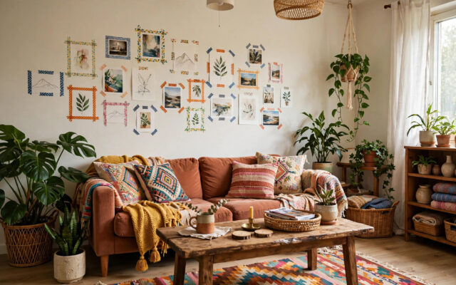
- Salon style (eclectic): varied sizes, mixed frames, organic arrangement. Personal, collected, dynamic. Best for mixed media — art, photos, mirrors, objects — and the most forgiving for beginners, since asymmetry hides imperfections.
Within salon style, professionals use invisible structure: an implied centerline (horizontal or vertical) that the arrangement balances around, or a consistent outer shape (a rough rectangle or square) that contains the variety. The eye reads the hidden geometry even when the frames vary wildly.
The Rules Professionals Never Break
Hanging height: the 57-inch rule
The center of your arrangement — or the center of a single piece — should hang at 57 inches from the floor, the average human eye level and the standard used by galleries and museums worldwide. For a gallery wall, measure 57 inches to the center of the entire composition, not to the center of any individual frame.
Exceptions: above a sofa or console, hang the arrangement’s bottom edge 6–8 inches above the furniture (which usually lands the center near 57″ anyway). In dining rooms where everyone is seated, drop to about 48–52 inches. Above a fireplace mantel, 6–12 inches above the mantel shelf.
Spacing: the 2-to-3-inch rule
Keep 2 to 3 inches between frames — consistent spacing is what makes varied frames read as one composition instead of scattered clutter. Wider gaps (4″+) dissolve the grouping; tighter gaps (under 1.5″) look cramped and make leveling a nightmare. Pick a spacing and hold it across the whole wall.
Balance, not symmetry
Salon walls do not need mirror symmetry — they need visual weight balance. A large dark piece on the left balances two medium pieces on the right. Distribute colors, sizes, and dark/light values evenly across the composition. Squint at your floor layout: if one side feels heavy, it is.
One unifying thread
Eclectic does not mean random. Give the wall one consistent element that ties everything together: all black frames with varied art, varied frames with a consistent color palette, all photographs, or a single mat color throughout. One thread of consistency lets everything else vary freely.
Building Your Collection: What to Include
A great gallery wall mixes categories, not just pictures:
- Art prints and originals: the backbone — landscapes, abstracts, botanicals, typography prints.
- Photographs: family photos, travel shots, black-and-white series. Consistent editing (all black-and-white, or all warm-toned) unifies disparate photos instantly.
- Mirrors: one small mirror in the mix adds light and depth — and gives the eye a resting place.
- Objects: a small wall sculpture, a decorative plate, antlers, a textile hanging. One or two three-dimensional pieces add richness; more than that gets fussy.
- Text pieces: a favorite quote, a vintage sign, sheet music. Use sparingly — one typographic piece per wall is plenty.
Sourcing on a budget: printable art from independent artists, your own photography printed large, thrifted frames spray-painted one color, children’s art in real frames (instantly elevated), and calendar pages or book plates. A gallery wall is one of the cheapest high-impact projects in decorating — the design is in the arrangement, not the price tags.
Frames and Matting: The Unifying Power
Frames do more unifying work than the art inside them. Professional approaches:
- All one frame: identical black (or white, or natural wood) frames in varied sizes — the safest, most foolproof route. The uniformity lets the art be wildly varied.
- Mixed metals/woods: black + brass + natural wood works beautifully if the art shares a palette. Limit to two or three frame finishes maximum.
- Vintage mix: ornate thrifted frames unified by a single spray-paint color — the highest character-per-dollar option.
Matting matters enormously. A mat (the border inside the frame) gives art breathing room and a finished look — cheap prints in matted frames look expensive; expensive prints crammed to the frame edge look cheap. White or off-white mats are the universal choice; use the same mat color across the wall for cohesion. For photographs, generous mats with smaller image openings look particularly gallery-like.
The Floor-First Method: Step by Step
- Lay it all out on the floor in the rough shape of your taped wall zone. Start with the largest piece slightly off-center (dead center is static; off-center is dynamic).
- Build outward, alternating sizes and orientations — large, small, medium, horizontal, vertical. Keep your 2–3 inch spacing with a ruler or a cut cardboard spacer.
- Photograph the layout from above (stand on a chair). The camera reveals imbalances your eyes miss — a cluster of dark frames, a lopsided side.
- Adjust, photograph again. Two or three rounds is normal. This is the design work — enjoy it.
- Transfer to the wall with paper templates. Trace each frame on kraft paper or newspaper, cut out, tape to the wall in the arrangement, and live with it for a day. Check sightlines from the room’s entry and seating positions.
- Hang through the paper. Nail directly through the template, then tear the paper away. Mark the nail position on each template first by measuring the frame’s hanging hardware offset — this is the step that prevents the “why is it crooked” mystery.
Hardware and Hanging Technique
- Picture-hanging hooks (the angled-nail kind) hold far more weight than a bare nail and damage walls less. Use two hooks for wide/heavy pieces — they prevent tilting.
- For drywall without a stud: use proper drywall anchors rated for the frame’s weight. A large framed piece can weigh 15–30 lbs — a bare nail in drywall will eventually fail.
- For plaster or brick: use masonry-appropriate anchors or adhesive strips rated for the weight; old plaster crumbles under standard nails.
- Adhesive strips (removable) are excellent for lightweight frames in rentals — follow the weight ratings exactly and clean the wall surface with alcohol first.
- Keep a small level handy and check every piece after hanging — then check again the next day, since wire-hung frames settle.
- Museum putty behind bottom corners keeps frames from shifting when doors slam — the professional’s secret for walls that stay perfect.
Gallery Walls by Location
Above the sofa
The classic placement. Size the arrangement to two-thirds the sofa’s width, bottom edge 6–8 inches above the sofa back. This is the most-seen gallery wall in the home — invest your best pieces here.
Staircase
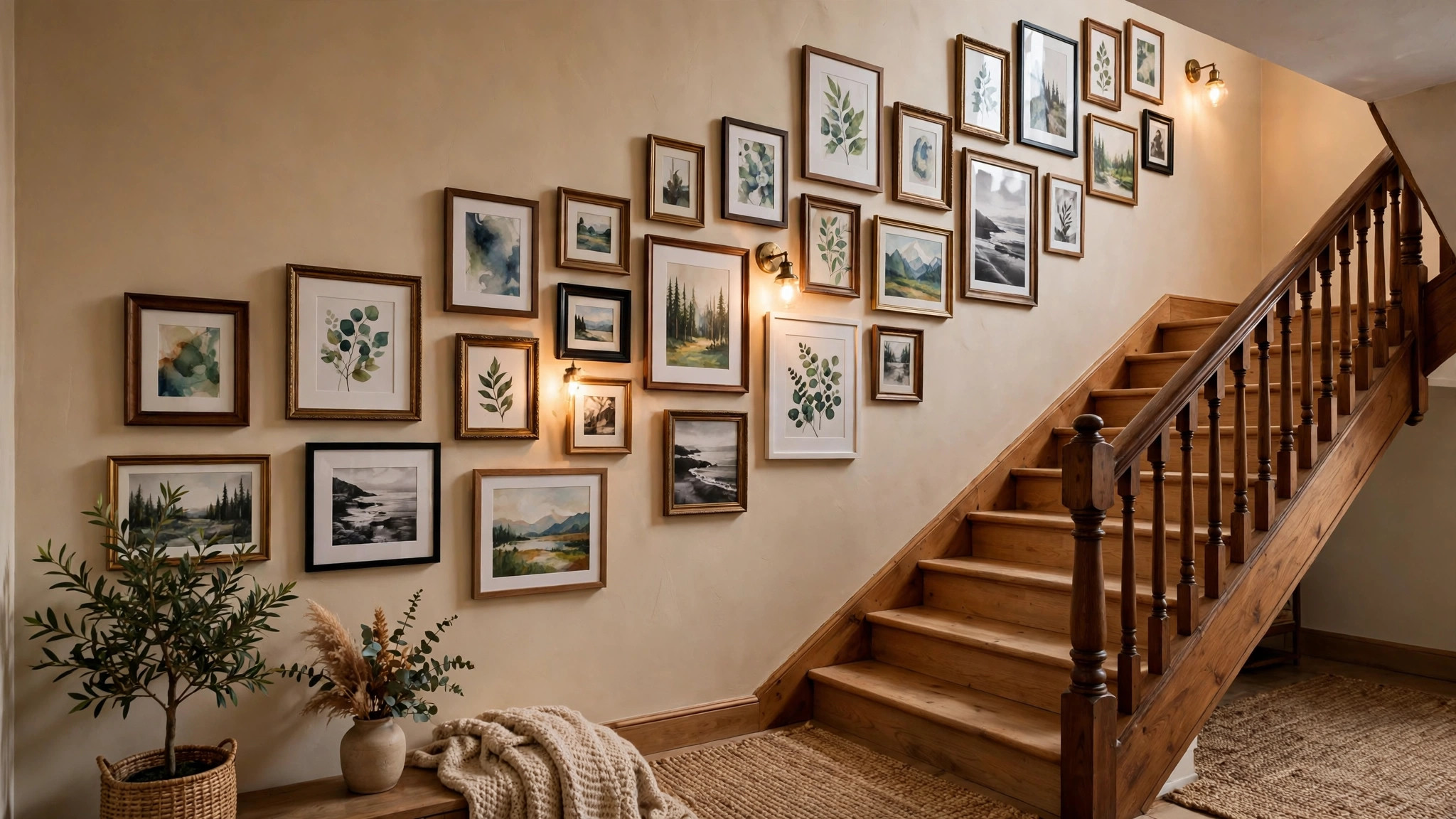
The most dramatic and trickiest location. Follow the stair’s diagonal: hang the arrangement so its centerline rises with the stairs, keeping each frame’s bottom edge roughly parallel to the stair slope. Start at the bottom of the stairs and work up. Measure from the stair nosing, not the floor — the “floor” is sloped here.
Hallway
Long narrow hallways suit a single horizontal series — a row of same-size frames at 57-inch center height. It draws the eye down the hall and makes the space feel designed rather than transitional. Keep frames slim-profiled so they do not intrude into the walkway.
Small walls and nooks
Do not neglect small walls — a tight cluster of 4–6 small pieces on a narrow wall (between windows, beside a door, in a reading nook) is often more charming than a grand arrangement. Scale the pieces to the wall: small wall, small frames, tight spacing.
Common Mistakes to Avoid
- Hanging too high. The number-one gallery wall error. When in doubt, lower it — art hung at proper eye level feels connected to the room; art near the ceiling feels abandoned.
- Inconsistent spacing. Eyeballing gaps produces a restless, accidental look. Use a spacer and keep every gap the same.
- No anchor. A gallery wall floating in the middle of a vast empty wall with no furniture beneath it looks lost. Anchor to furniture or architecture.
- Too much variety, no thread. Ten different frame styles, clashing art palettes, and mixed mat colors read as clutter. One unifying element is non-negotiable.
- Skipping the templates. Nailing directly into the wall “freehand” is how walls end up with twenty holes and a crooked result. Paper templates take thirty minutes and save the wall.
- Forgetting to step back. Check the wall from the room’s main viewpoints — the doorway, the sofa — not just from two feet away. Gallery walls are experienced at distance.
Evolving Your Gallery Wall Over Time
Here is something the tutorials rarely mention: a gallery wall is never finished, and that is its greatest strength. Unlike a single statement piece that you live with until you redecorate, a gallery wall is a living composition. It grows with you — and planning for that growth makes it better from day one.
Leave room to grow
When laying out your initial arrangement, do not fill the zone edge-to-edge. Leave one or two “open” areas within the composition — breathing room that future pieces will occupy. A wall that is 85% full on day one looks intentional; the same wall at 100% looks like it cannot accept the travel photo you will love next year. Growth space is a design decision, not an unfinished look.
The swap system
Adopt a simple rule: one in, one out — or one in, shifted. When a new piece arrives, either replace the weakest piece in the arrangement or re-hang the section to absorb it. Because you used paper templates and consistent spacing, re-hanging a cluster takes twenty minutes, not a weekend. Keep a small stash of matching frames on hand so new art integrates instantly instead of waiting months for the “right” frame.
Seasonal and life-stage refreshes
Gallery walls shine at marking time. Swap in holiday or seasonal pieces (a winter landscape, a bright summer abstract), rotate children’s art as they grow, add travel photos after trips. These small rotations keep the wall feeling alive — and they cost nothing, since the hardware and layout already exist. Photograph the wall once a year; the series becomes a quiet visual diary of your household’s evolving taste.
When to start over
Every few years, a wall can accumulate into clutter despite your best efforts — too many small pieces, the unifying thread frayed. When that happens, take everything down and rebuild from the floor using the same method as day one. A fresh edit every 3–5 years keeps the wall curated rather than accumulated. The pieces you remove are not failures; they are the archive the current wall was selected from.
Frequently Asked Questions
How high should a gallery wall be hung?
A: The center of the entire arrangement should sit at about 57 inches from the floor (average eye level). Above furniture, keep the bottom edge 6–8 inches above the furniture’s top. Measure to the composition’s center, not to any single frame.
How far apart should frames be on a gallery wall?
A: Two to three inches between frames, kept consistent across the whole wall. Consistent spacing is what makes varied frames read as one intentional composition.
Can I mix frame colors on a gallery wall?
A: Yes — limit yourself to two or three finishes (e.g., black, brass, natural wood) and unify through the art palette or mat color. Alternatively, use one frame color throughout for the foolproof route.
Should all the art match?
A: No — variety is the point. What should match (or coordinate) is one unifying element: frame color, mat color, or overall color palette. Varied subjects with a consistent palette look collected; varied everything looks chaotic.
How do I hang a gallery wall without damaging the walls?
A: Use removable adhesive hanging strips rated for each frame’s weight — they work well for lightweight to medium frames. For heavier pieces, there is no truly damage-free option; use proper anchors and accept two small holes (easily patched) over a fallen frame.
What do I do with a sloped staircase wall?
A: Let the arrangement’s centerline follow the stair’s rise — hang frames so the composition climbs with the stairs, keeping consistent spacing measured perpendicular to the slope. Start from the bottom step and work upward, measuring each frame’s position from the stair nosing below it.
How many pieces make a good gallery wall?
A: There is no magic number — 5 pieces can make a beautiful small arrangement and 20 can make a stunning large one. What matters is filling the defined zone with balanced density: the wall should look intentionally full, with no awkward empty patches inside the arrangement’s outer shape.
Conclusion
Gallery walls look effortless when they are anything but — and now you know the effort involved: plan on the floor, tape the zone, hold your spacing, hang at eye level, unify with one thread, and template before you nail. Those six habits separate professional results from drywall regret.
Start this weekend. Pull the art you already own out of closets, print the photos sitting on your phone, grab painter’s tape and kraft paper, and lay it all on the living-room floor. The arrangement you build there — photographed, adjusted, templated — will go up on the wall in an afternoon and stay up for years, getting better every time you notice a new detail in it. That is the real magic of a gallery wall: it is never finished, and it is always yours.