Walk into any furniture showroom and you will notice something strange: the rooms look incredible, but you would never actually live in them. That is because showrooms are arranged to sell furniture, not to host your life. A designer’s living room, on the other hand, is arranged around how people actually move, sit, talk, and relax — and there is a method to it that anyone can learn. It starts with one unglamorous truth: good furniture arrangement is mostly about traffic flow and conversation, and only a little about how things look in a photograph.
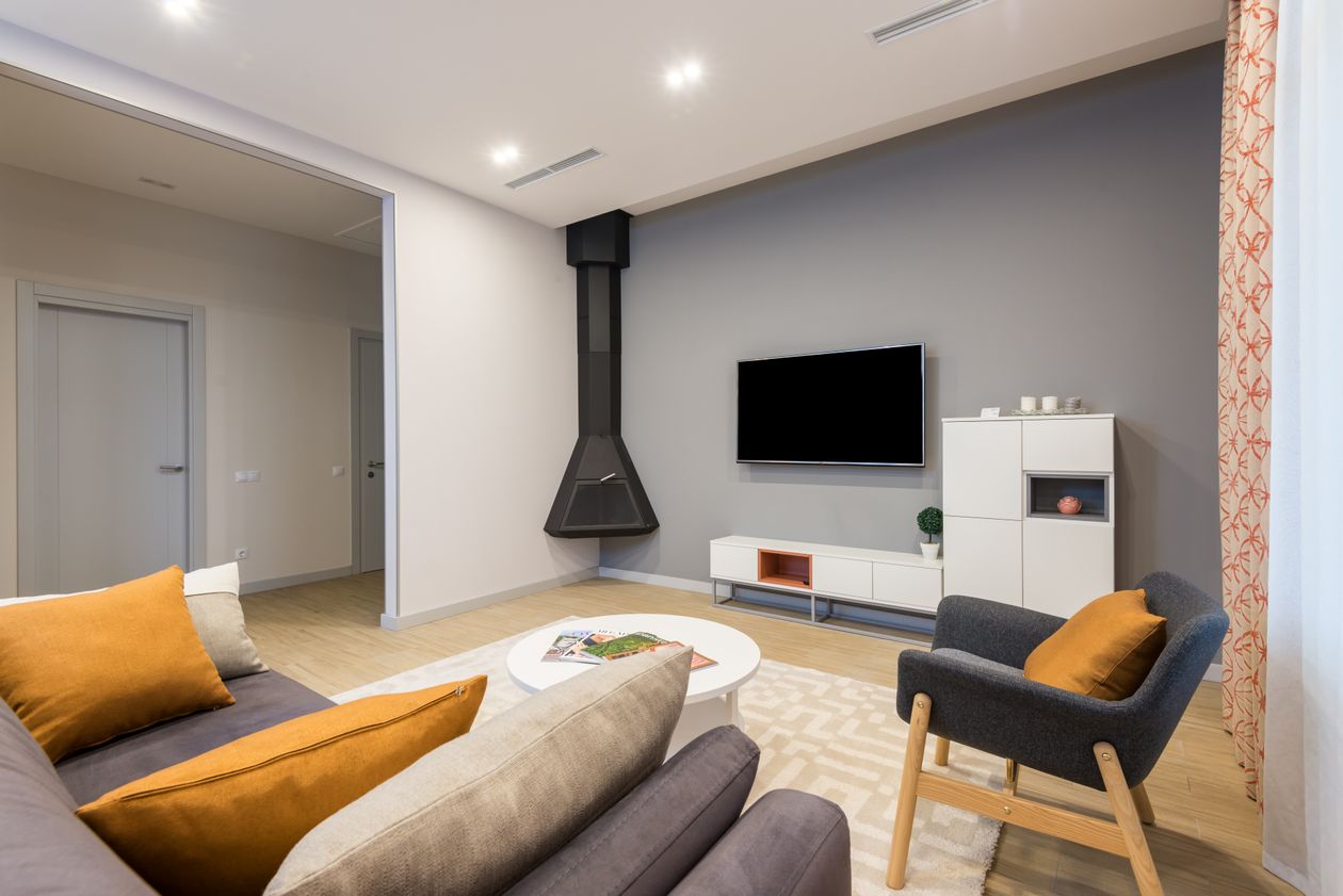
I learned this the embarrassing way. In my first apartment, I arranged my living room the way I had seen in catalogs: sofa against the longest wall, coffee table in front, television mounted opposite. It looked fine. It also meant that anyone walking from the front door to the kitchen cut straight through the middle of my seating area, stepping around the coffee table like it was an obstacle course. My guests were literally navigating furniture to get a glass of water. A designer friend visited, laughed, and moved exactly two pieces. The traffic path went around the seating area instead of through it. Same furniture, same room, completely different house.
Rule One: Map the Traffic Before You Place a Single Piece
Every room has natural paths — the routes people take from door to door, from the hallway to the kitchen, from the couch to the bathroom. Designers call these circulation paths, and they are the skeleton of the room. Everything else hangs off them. The rule of thumb is simple: main walkways need thirty to thirty-six inches of clearance, and secondary paths (say, from the sofa to the bookshelf) need at least twenty-four.
Here is the practical way to do it. Stand in your doorway and walk the routes you actually take in a normal day. Then tape them on the floor with painter’s tape, or just lay down strips of newspaper. You will be shocked how much space the paths eat — and how often furniture is sitting in the middle of one. The single most transformative move in most living rooms is pulling the seating group away from the traffic lane. Nobody should have to walk through your conversation area to get somewhere else. If your current layout forces that, the layout is wrong, not the room.
In open-plan spaces, traffic mapping is even more critical because there are no walls to guide people. A rug, a sofa with its back to the walkway, or a console table can create an invisible corridor that keeps foot traffic at the edges of your living zone instead of through it.
Build Around a Focal Point, Not a Wall
Ask a designer what the first decision in any room is, and most will say the same thing: identify the focal point. It is the thing the room is “about.” In most living rooms, it is one of three things: a fireplace, a large window with a view, or the television. Be honest about which one it actually is in your household. If the family watches TV together every night, the TV is the focal point, and arranging the room as though the fireplace were the center will just mean everyone sits sideways.
Once you have named it, orient your main seating toward it. The sofa — the largest piece — usually sits facing or angled toward the focal point, and it goes in first. Everything else arranges around the sofa. This is the opposite of how most people furnish a room, which is to buy a bunch of pieces and then try to make them fit. Designers place the anchor first and let it dictate the rest.
One refinement: if you have two competing focal points, like a fireplace and a TV on different walls, do not try to serve both equally. Pick the primary one for the main seating, and give the secondary one a smaller secondary spot — a single reading chair angled toward the fireplace, for example. Rooms that try to face two directions at once end up feeling restless.
The Conversation Distance Rule
Here is a number designers live by: people sitting and talking should be no more than eight feet apart, and ideally closer to four or five. Beyond eight feet, you are shouting. Beyond ten, you might as well be in different rooms. This is why oversized living rooms with furniture pushed to the walls feel so unwelcoming — the conversation distance is broken.
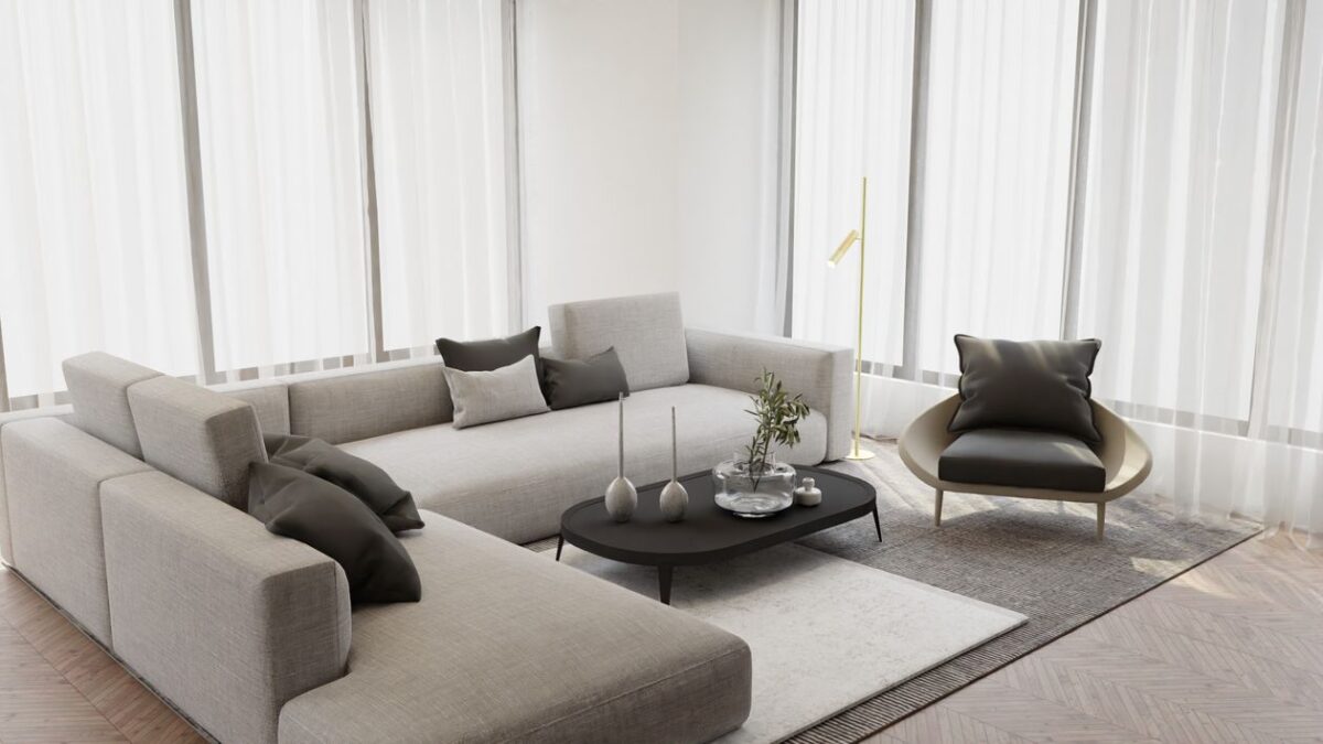
In practice, this means pulling furniture inward. The classic designer layout is a seating group where the coffee table sits fourteen to eighteen inches from the sofa — close enough to set down a drink without standing — and chairs sit at angles to the sofa, not in a straight line across from it. An L-shape or a loose U-shape invites conversation. Two sofas facing each other across a coffee table is the most formal and symmetrical option, and it works beautifully in larger rooms.
Side tables belong within arm’s reach of every seat. This is one of those details that separates a designed room from a furnished one: nobody should have to stand up to put down a coffee cup. If a chair has no surface next to it, add a small table or a floor lamp with a built-in tray. Your guests will never articulate why the room feels comfortable, but this is a big part of it.
Float the Furniture (Yes, Even in a Small Room)
The beginner move is to push every piece against the wall, on the theory that it maximizes floor space. Designers do the opposite: they float furniture away from the walls to create a defined seating area. It sounds like it would waste space, but it actually makes rooms feel larger and more intentional. A sofa pulled even six inches off the wall casts a shadow line behind it that gives the wall depth. A seating group floating in the middle of a large room, anchored by a rug, reads as a “room within a room” instead of furniture scattered at the edges.
The exception is genuinely tiny rooms, where floating the sofa would block the only walkway. Even then, float what you can: pull the chairs in at an angle, bring the coffee table closer, and let at least one piece breathe off the wall. The goal is a seating arrangement that feels like a group, not a lineup.
Behind a floating sofa, a narrow console table is a designer’s secret weapon. It fills the gap between the sofa and the wall, gives you a surface for lamps and books, and visually finishes the back of the arrangement. It is one of the cheapest ways to make a room look professionally done.
Balance the Visual Weight
Every piece of furniture has visual weight — how heavy it looks, which is not always the same as how heavy it is. A dark, bulky armoire has a lot of visual weight. A glass coffee table has almost none. A tall bookshelf has more than a low bench. Designers distribute this weight around the room the way you would balance a seesaw: heavy pieces opposite each other, not clustered on one side.
Walk into your room and squint. Literally squint until the details blur. Does one side of the room look like a dark mass while the other side looks empty? That is an imbalance, and it makes the room feel lopsided even if you cannot say why. The fix is usually to move one substantial piece to the lighter side — shift the bookshelf to the empty wall, or swap a heavy armchair for the light side and move a plant to the heavy side.
Height matters too. If all your tall pieces are on one wall, the room tips visually. Spread height around: a tall plant in one corner, a floor lamp in another, a tall bookcase on a third wall. The eye should travel around the room, not get stuck in one corner.
Think in Zones, Especially in Open Plans
Modern homes increasingly have one big open space instead of separate rooms, and furniture arrangement is what turns that space into actual rooms. Designers create zones — a living zone, a reading zone, a work zone — using furniture as the dividers.
The tools are simple. A rug defines a zone instantly: everything on the rug belongs to one activity. The back of a sofa is a wall: place it perpendicular to the room and it separates the living area from the dining area behind it. A bookshelf turned sideways becomes a room divider that still lets light through. Even a pair of chairs angled toward each other with a small table creates a conversation nook that feels separate from the main seating.
The mistake to avoid is the bowling alley — one long room with all the furniture lined up along the walls and a vast empty corridor down the middle. It happens in open plans constantly. Break the length into two or three zones and the same square footage feels twice as usable.
Leave Room for Real Life
Here is where designer theory meets reality: the room has to work on a Tuesday, not just in a photograph. That means accounting for the things catalogs never show. Where do the kids drop their backpacks? Where does the dog sleep? Is there a spot for the laptop when someone works from the couch? Does the recliner actually recline without hitting the wall behind it? (Measure this. Everyone forgets to measure this.)
Designers build in what they call “landing zones” — a bench or a basket near the entrance for the daily clutter, a lidded basket next to the sofa for throws, a tray on the coffee table that corrals the remotes. These are not decorating decisions; they are maintenance decisions. A room that is easy to tidy stays looking arranged. A room that fights your habits will look messy by Thursday no matter how beautifully it was laid out on Sunday.
And give yourself permission to break the rules for how you actually live. If your family plays board games every Friday, the coffee table should be big enough for the board, full stop. If someone reads in the same chair every evening, that chair gets the best lamp and the side table, even if symmetry says otherwise. The best-arranged room is the one that fits its people. Everything else is just technique to get you there.
Start with the traffic paths, anchor on the focal point, keep conversation distances human, balance the weight, and zone the space. Do those five things and your living room will feel like a designer touched it — because, in the ways that matter, one did.
Start With the Largest Piece and Work Down
Professional designers do not arrange rooms all at once — they place pieces in order of size, largest first. The sofa goes in first, because it is the anchor everything else responds to. Then the secondary seating: the loveseat, the armchairs. Then the tables, then the lighting, then the accessories. Each layer is positioned relative to the one before it.
There is a practical reason for this discipline beyond aesthetics. The largest piece has the fewest placement options — a sofa really only fits in two or three spots in most rooms. Small pieces are flexible; they can go almost anywhere. If you place the small things first, you end up wedging the sofa into whatever space is left, which is how you get a beautiful side table arrangement and a sofa blocking the hallway. Anchor first, accessorize last.
This ordering also prevents the most common overspending mistake in furnishing: buying accessories before the big pieces are placed. People fall in love with a lamp or a throw pillow at the store, bring it home, and then discover it fights with the sofa they buy a month later. Get the anchors right first. The finishing touches are called finishing touches because they come at the finish.
Symmetry vs. Asymmetry: When to Use Each
Symmetrical arrangements — matching chairs flanking a sofa, identical lamps on either side of a console — feel formal, calm, and intentional. They are the easiest arrangements to get right, which is why designers recommend them to beginners: symmetry is almost impossible to mess up. If you want your living room to feel serene and pulled-together with minimal effort, mirror your layout around a central axis and you are most of the way there.
Asymmetrical arrangements — a single chair balanced by a floor lamp and a plant on the other side, a gallery wall that is deliberately off-center — feel more relaxed, creative, and personal. They are harder to pull off because the balance has to be felt rather than measured: a tall plant on one side can balance a low bookshelf on the other if their visual weights are roughly equal. The payoff is a room that looks collected over time rather than purchased in a set, which many people prefer.
Most real living rooms end up as a mix: a symmetrical core (the sofa, the coffee table, the matching side tables) with asymmetrical edges (the reading chair in the corner, the plant by the window, the bookshelf that only fits on one wall). That combination — order at the center, personality at the margins — is what makes a room feel both designed and lived-in.
Test-Drive the Layout Before Committing
Here is the step that costs nothing and saves the most regret: live with the arrangement before you finalize it. Designers working on real projects tape out furniture footprints on the floor and walk through the room for days, adjusting by inches. You can do the same with painter’s tape and an afternoon.
Tape the outline of each major piece on the floor in its planned position. Then actually use the room: walk the traffic paths, sit on the floor where the sofa will be and check the sightlines to the television and the window, stretch your legs where the coffee table will sit and confirm you can reach it. You will discover things no floor plan shows — that the chair you planned for the corner gets blasted with afternoon sun right in the eyes, or that the coffee table position forces everyone to walk around it to reach the kitchen.
Give it at least a weekend. Move the tape, try the alternative you were unsure about, sit with each version. Furniture is heavy and returning it is miserable; tape is cheap and peeling it up takes seconds. The designers who do the best work are not the ones with the most talent — they are the ones who test the most before committing.
Common Arrangement Mistakes (and Their Five-Minute Fixes)
A few mistakes show up in living rooms everywhere, and each has a quick fix. The too-small rug: if only the coffee table fits on it, size up so at least the front legs of every seat touch the rug. The TV mounted too high: the center of the screen should sit at seated eye level, roughly forty-two inches off the floor — craning your neck upward for two hours is not a design choice, it is a chiropractor’s referral. Furniture lined up like a waiting room: pull the chairs in at angles and bring the coffee table within eighteen inches of the sofa so the seating reads as a group.
The blocked window: if a tall bookcase is eating your best daylight, swap it with a lower piece and let the light in. The single overhead light doing all the work: add a floor lamp and a table lamp and watch the room gain depth overnight. None of these fixes costs more than an hour and a thrift-store lamp, and together they account for most of the difference between a room that looks furnished and a room that looks designed.